Featured design: SMALLER Rust Brown and Blue on Cream Annie by danika_herrick.
Featured substrate: Peel and Stick wallpaper. Featured paint: Good Jeans by Clare Paint.
Ever wonder how some people manage to flawlessly decorate their homes? That journey begins once you find clarity on both the energy you want your home to have and the story you want it to tell. Two big ways to change how your home looks are by adding pops of color and design through wallpaper and paint. Clare Paint ambassador Ashley Whiteside is here to share how you can create, hone and highlight your home’s story through learning how to perfectly pair them together.
Let Your Home Tell Your Story
Ashley: When I visit a home, I have questions. Does the decor tell me more about the people who live there? What kinds of things deeply inspire them? What makes them comfortable? What photographed moments are they proud enough to frame? Have they displayed collections gathered while traveling the globe? Have they brought these parts of their lives into their home’s story? I always hope so, because homes that reveal stories are EXCITING.
Your Interior Design Style Can Be Your Superpower
The best part about interior design? There is no wrong style as long as it’s in harmony with the people living there! And perhaps the second-best part is that finding your confidence within this space allows you to create your space—no one else’s.
But why don’t we see perfected instances of style more often? I think it’s because working with color and pattern can feel intimidating as heck, especially if you’re new to design or trying to dip your toe into a new aesthetic! While it can all feel intimidating, once you have some more knowledge under your belt, it gets easier.
To help with that, I have some tried-and-true tips to share that will help you gain the confidence you’ll need to begin or perhaps determine your next steps if you’re unsure. These tips are focused around the first tools in my arsenal—pattern and color! For this project, that means working with both wallpaper and paint.
3 Steps to Start Matching Wallpaper Design With Paint
Define Your Project
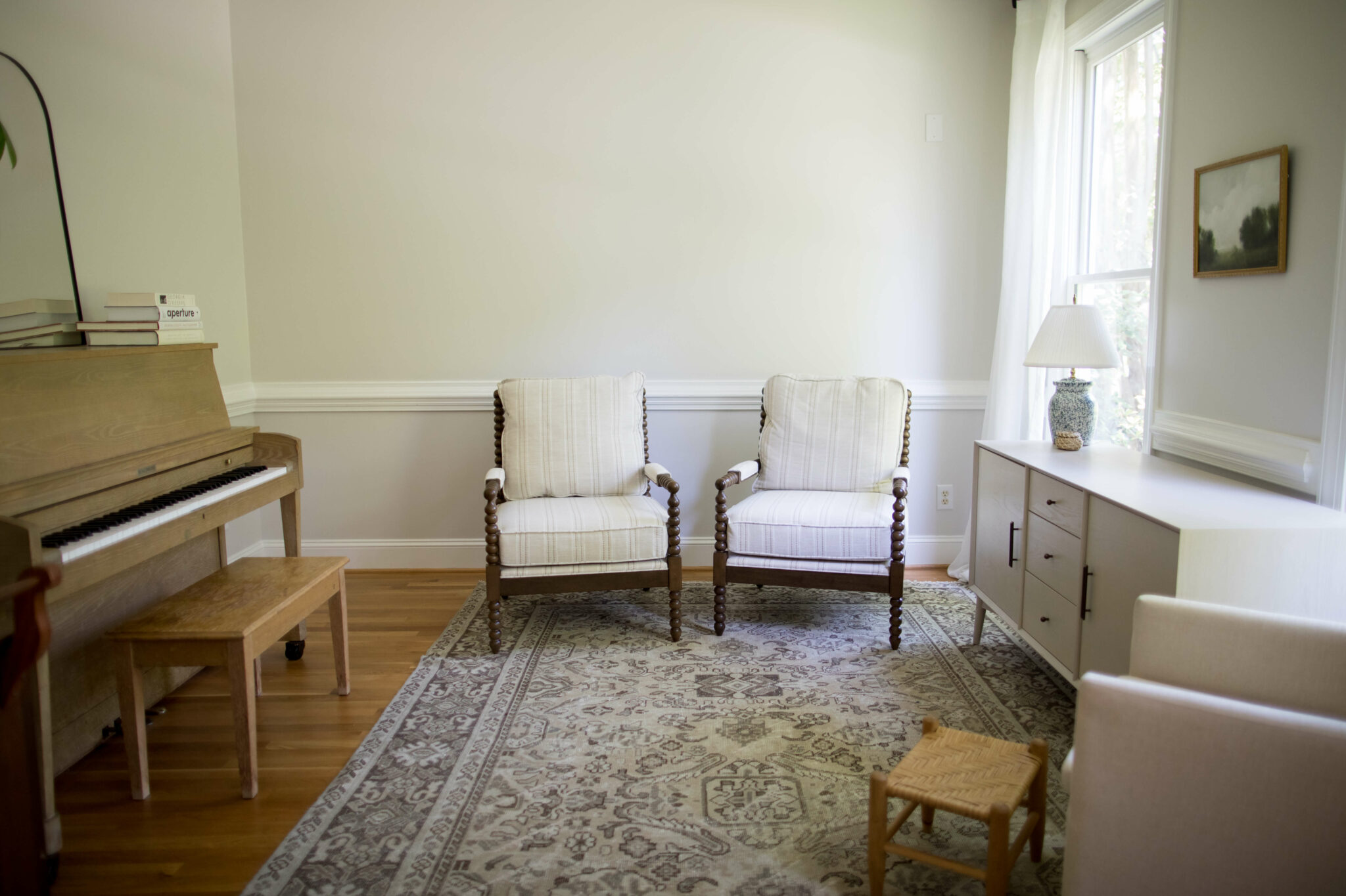
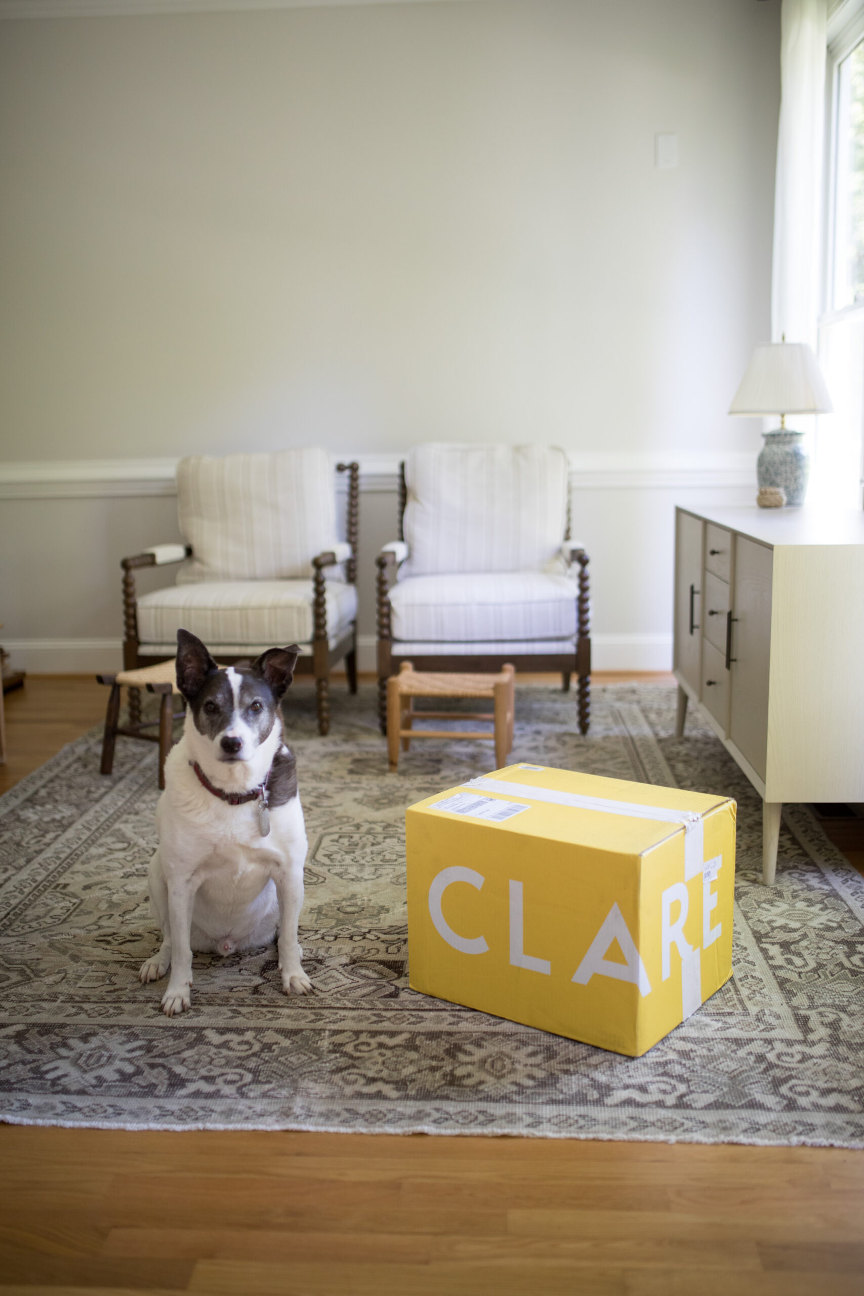
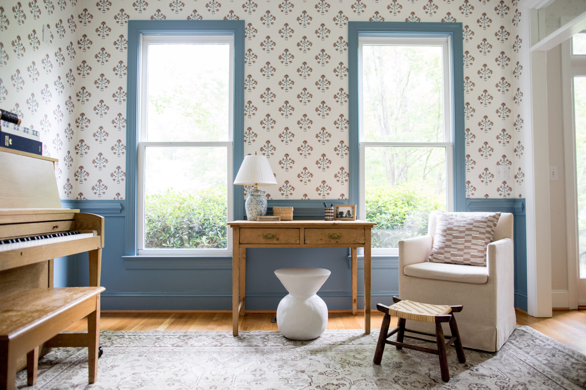
Trying to redo your whole house at once is a daunting task. Instead, walk through your home and pinpoint a specific room or area you want to tackle. For this post, I worked with Spoonflower’s Collaborations Manager Katherine Miles Jones to redo a sitting room in her family’s home. After touring and talking about her home, we ultimately decided to makeover the room right off the entryway, as it could effectively help set the tone for the whole house. The room’s before state was giving “we haven’t tried” vibes, which no longer worked for their family. After living in the space for a while, Katherine was finally ready to make this room over! Let’s go!
Ask the Right Questions, then Create a Collection
We knew we wanted to add both paint and wallpaper to the space, which meant asking a few questions before we could make color or design selections. The questions for your own space may be different, but the goal here is to think about how you’re going to use the room and how you want it to feel when you’re done.
Our questions for Katherine’s space were:
• Beyond the known functions, how can you make this space come alive?
• How do you want this room to feel?
• What’s the right balance between the tone and the room’s intention?
• How bold do you want to go?!
Once we knew what room to redo and had answers to our questions, Katherine created a wallpaper design collection. As we discussed the project, she repeatedly mentioned a pull to medium gray blue, a color that kept catching her eye. For your room, taking note of what colors and designs turn your own head can be helpful too, as listening to your gut is an important part of this process, which we’ll go over later.
(Re)Define the Energy of the Space
Color choices help create a space’s energy. Think of how often you see gyms painted in bright colors. Those colors were chosen because they are energizing! Alternatively, it’s common to see spas decked out in white and nurseries swathed in pastels. The latter spaces are aiming for calming, low energy colors. In both of those examples, the colors selected for the spaces match the intention of those spaces. When you define the energy you want a room to have, it can guide you in the right direction for both your paint color and your wallpaper design.
And so can contrasting colors! While main color selections play a starring role, don’t forget about contrast—the difference in surrounding colors also plays an important role. For example, the black-and-white striped jersey worn by a referee on a football field stands out because the jersey’s color contrast is so notable. High-contrast colors are attention grabbers that can further add energy to your decor.
The big takeaway? Knowing a space’s energy needs before you get started will help you love what you create, because you can match that energy with your color choices. Taking time to know what type of room you want (as well as perhaps ordering some sample wallpaper swatches) is key—and allows you to confidently know what kind of vibe you’re trying to create! – Ashley Whiteside
Don’t forget to take the room’s natural features into account. What does your space have that you can’t change? For Katherine’s sitting room, we quickly knew we wanted to create an area that was inviting to all who enter her home. Coupling the original wood floors, drool-worthy flooding of natural light and this family’s relaxed-but-charming ways, the brief became clear: add visual interest without overwhelming. Delight, but don’t be loud about it.
4 Tips for Pairing Wallpaper With Paint
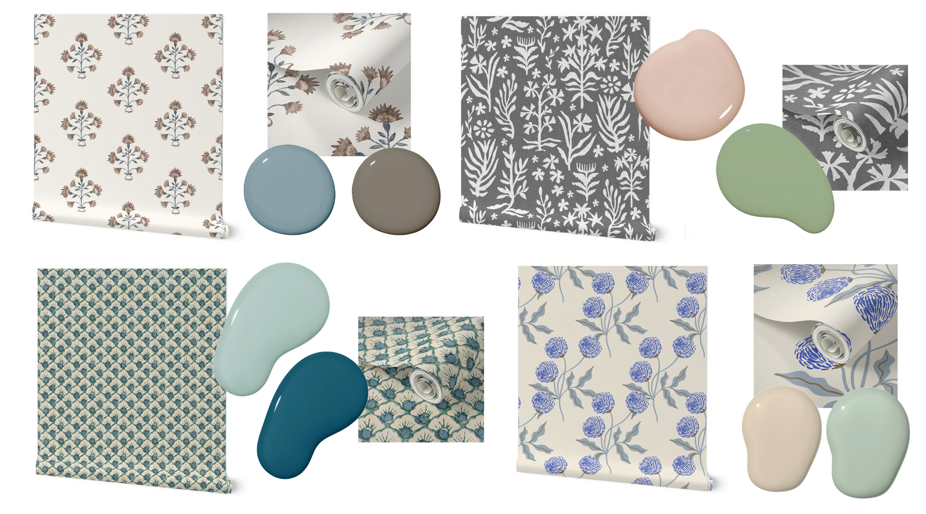
As many DIY decorators can end up terrified of making mistakes, here are some helpful tips for pairing a wallpaper design to a complimentary paint color so you can fine-tune your surroundings to your liking. Each tip also includes two possible color options I gave Katherine that matched her wallpaper designs. With these ideas in mind, feel free to play a bit at this stage, order some swatches and paint chips and dive in!
1. Find your starting point and build around it.
It doesn’t matter what you choose first, your wallpaper design or your paint selection. However, do remember that if you choose your wallpaper design first, you may need to be flexible with your paint color, and vice versa. When thinking about colors, if you’re hoping to match them with existing furniture and/or other fixed items in the room, think about what coordinates well with what will be staying put!
In the first example of concept for Katherine, I suggested either a blush pink (Clare’s Meet Cute) or an avocado green (Clare’s Avocado Toast) as possible paint colors first, then searched for a compatible wallpaper design from her collection. Though there are no pinks or greens in the wallpaper itself, since gray is a neutral, it still works.
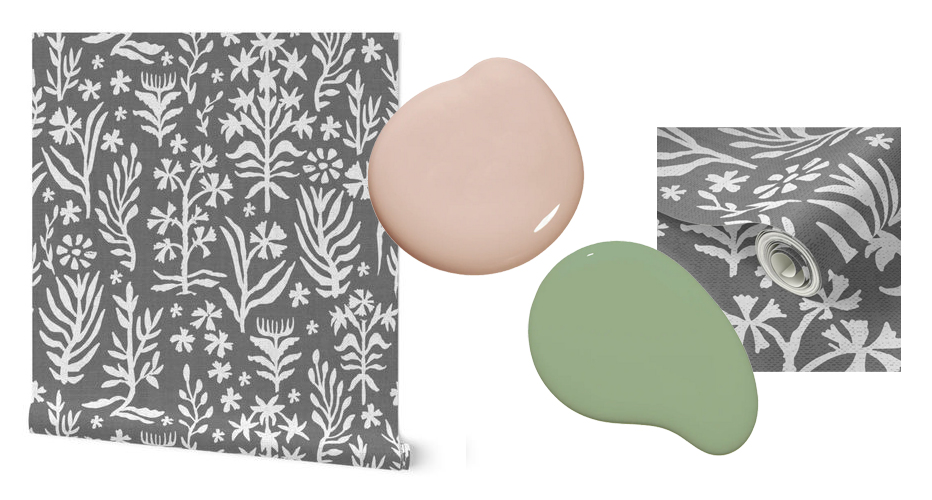
Featured paint: Meet Cute and Avocado Toast by Clare Paint
2. Entry-level risk is still rewarding.
If you’re feeling risk-averse, the safest choice for choosing a paint color for the areas around your wallpaper will be the white/off-white/neutral that is the closest match to the wallpaper. If your wallpaper design has a cool-toned white background, you’ll want a cool white trim, and same for matching a warm wallpaper design to a warm paint color. In fact, it’s also likely to be cohesive if you match any color of the wallpaper design exactly with your paint selection.
For Katherine’s room, in addition to the cream possibility, I met the muted tones of this wallpaper design with two paint options: a warm brown (Clare’s Dirty Chai) that matched to the design’s deepest brown, and a medium blue (Clare’s Good Jeans), a lighter but still warm nod to the wallpaper’s blue hues.
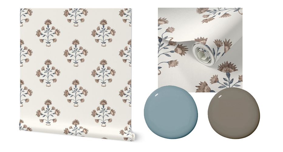
Featured paint: Dirty Chai and Good Jeans by Clare Paint
3. Matching a color in the wallpaper allows you to control the drama.
An easy way to make any room more of a statement is to pair your wallpaper choice with the darkest shade on the paper. To control the hue, you can play the paint chip game! If the exact match is the chip’s darkest color and the most saturated, slide up the paint chip. This will give the same undertones but will have a lighter color. To double check your work, take your wallpaper and paint swatches into multiple lighting scenarios to see if they still complement each other. Sometimes what works in your dark office while you plan is going to prove “off” when you take it outside and inspect in natural light.
For the next concept, I chose two color options, a dark teal (Clare’s Sublime) to bring out the deepest blue in this wallpaper selection, and to still coordinate but brighten it up a notch, a robin’s egg blue (Clare’s Views). The latter color was a secondary option, which works because it makes a visual nod to the colors in the design, with less saturation.
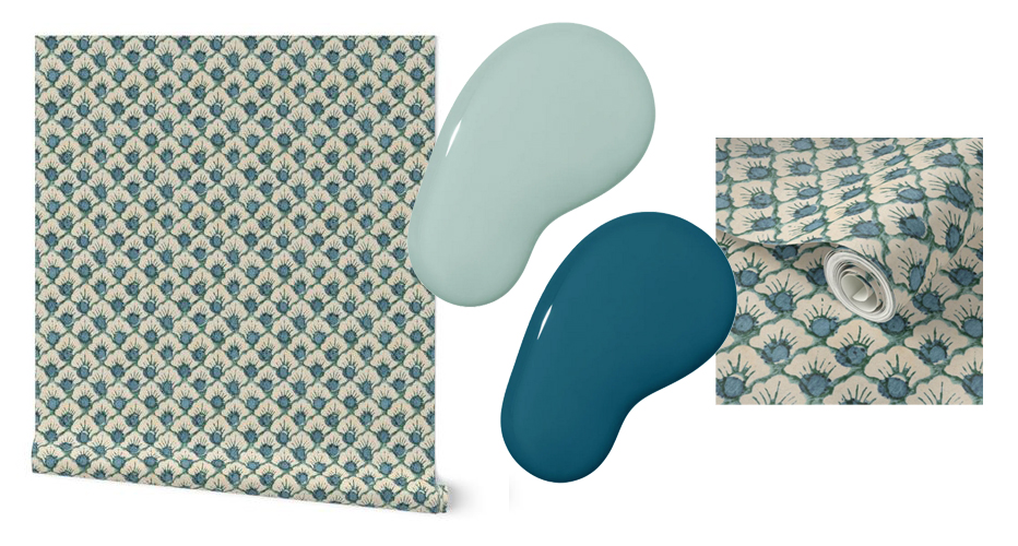
Featured paint: Sublime and Views by Clare Paint
4. You can play with your pattern.
You can add depth to your scheme with varying levels of color playing for contrast. Imagine a very thinly striped wallpaper, say, a ticking stripe in ivory and charcoal—it’s a small-scale pattern with neutral colors. That’s a design choice that comes across as stylish, subtle and low risk and flawlessly complements more traditional styles. Take that same design concept and make the stripe 12″ wide in white and baby blue. The large-scale and subtle contrast in that selection definitely gives bold energy to a room in a way that leans into more modern styles. Though both designs are stripes, how you employ color and scale clearly announces your energy.
In the fourth concept for Katherine’s space, we went for a fresh and large-scale pattern. To keep it grown up, she could pair this design with a warm beige (Clare’s Turbinado) or match the color’s vibe vs. its exact tones with a similarly fresh and playful mint green (Clare’s Two Scoops).
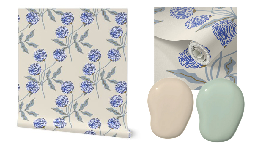
Featured paint: Turbinado and Two Scoops by Clare Paint
What to Consider Before Painting
• Paint before wallpaper. I’d recommend painting before papering—doing so prevents getting any paint on your precious wallpaper accidentally.
• Think about your space’s wall transitions. Depending on your space, you might have any number of possible transitions: chair rail, molding, board, batten or simply baseboards and trim. Any of these options are most frequently painted in a semi-gloss to be easiest to clean or a high-gloss if you’re going for something particularly fancy!
• No decorative details? If you don’t have those decorative details, you can choose the paint finish that works best for your project. For example, what about painting the ceiling (flat or eggshell finish) and baseboards (semi-gloss) your accent color and wallpapering the walls? You could also reverse that—painting the walls and trim your accent color and wallpapering the ceiling! Note: Wallpapering your ceiling is a job worth hiring out, for what it’s worth. (Ask me later if I learned that the hard way.)
How to Choose Your Winning Design
After sharing all the concepts with Katherine, she pared it down to a few favorites. Once we had a few final selections to choose from, it was time again for a few questions to pinpoint a winning pair. A very important detail to remember when answering these questions? Don’t discount what your gut is telling you.
• What does your gut say about what option you should choose? (Note: It may say scrap everything and start in a new direction, and which point, you’ll need to start from the top!)
• Which option makes you most excited?
• What pairing feels right for the style of your home’s architecture?
• What selection meets the energy needs of everyone living in the home when they use that space?
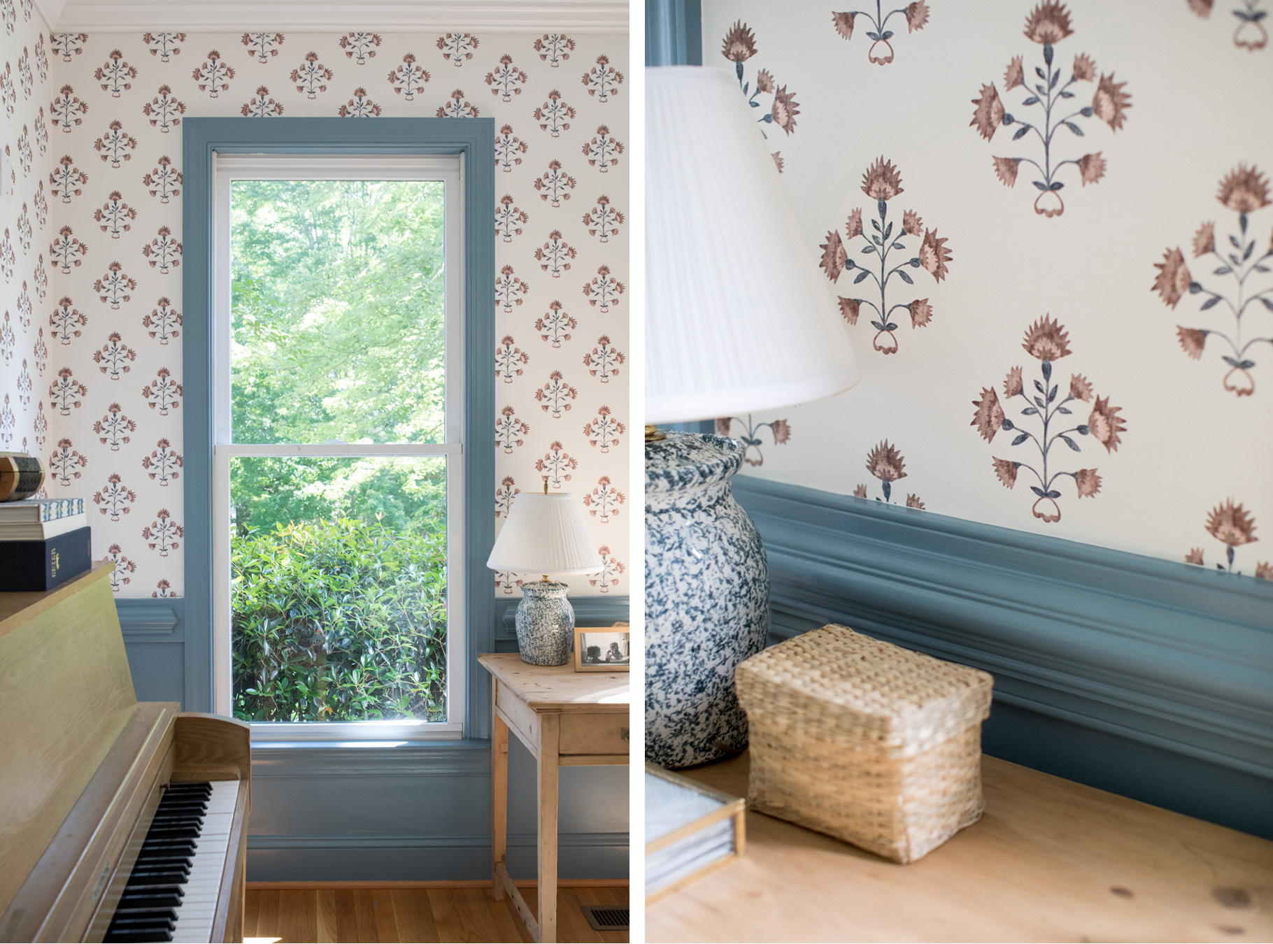
In Katherine’s case, after asking all these questions, we went back to where we started. Her gut and pull was to use the medium gray-blue that was so inspiring right from the beginning—funny how sometimes you know all along! How did she come across the winner? She took a few days to walk past all of the ideas, which were set up as swatches in the space, and let the winner come to her. The design that’s right for you is often the one that *feels good,* even when you can’t put a finger on why it does.
If you’ve been looking at a wallpaper swatch taped to your bathroom wall for months and find yourself dreaming of how to use it but feeling stuck, I hope you’ll take a cue from Katherine’s experiment and lean into it. And you? What can I learn about you when I come over to your home? Whatever your style, I can’t wait to see it.
Styling and photography by Katherine Miles Jones.
Frequently Asked Questions
Want More Interior Design Insight?
The post How to Pair Your Wallpaper With the Right Paint appeared first on Spoonflower Blog.
